

Thursday, May 16, 2013
More Colors!
Hey all, it’s me again with another color test for Carla. This time I played around a little with lighting effects, warm background with a cool foreground. I also added Chopper to this drawing (Carla’s favorite machete...hey, a girl has to accessorize...). I gave Chopper a course metal texture as well as some blood splatter in photoshop which I think adds a lot of character to the machete.


Friday, May 10, 2013
Carla Color Test
Here is what Carla looks like when she is powered up. Most hunters are going to be unique patterns, Carla has a rose and thorns theme. I may add some vines with thorns wrapping around her arms but haven't decided yet. All in all I am really happy with the colors. Carla's hair is going to be a neutral black but will be colored as a dark grey (as will blood related Calaveras', it will be a dominant trait). Same with her shirt, it's black but colored as a dark grey, never go full black as it will appear as just a blob in your drawing.


Monday, May 6, 2013
Carla Calaveras
Here is my character design for Carla, the title character and protagonist from my comic that I am making. Carla is a 16 year old monster hunter, she is brave, smart, cool under pressure and sarcastic (all qualities I admire). I want my characters to be well rounded and realistic so I try to avoid pitfalls and stereotypes. Carla is tall and skinny, but I made sure to not just give her twig legs. The legs are in fact long and skinny, but I pay attention to add shape as well.
I love the picture in the corner of Carla crying, I think it adds a lot to her. Something I want to explore is the depiction of crying in my comic and all the range of crying that exists. Crying for loss, crying because you fail, crying because you are happy or relieved, crying because you just can't fucking take it any more, crying because you were rejected and many many more reasons... all of these should look different from each other. So the question you should ask is not "how does my character look like when he/she is crying?" but "what is my character crying ABOUT? and what does that look like?" because it does matter.
P.S. - I would tell you what she is crying about in this particular picture but...spoilers, so no.

I love the picture in the corner of Carla crying, I think it adds a lot to her. Something I want to explore is the depiction of crying in my comic and all the range of crying that exists. Crying for loss, crying because you fail, crying because you are happy or relieved, crying because you just can't fucking take it any more, crying because you were rejected and many many more reasons... all of these should look different from each other. So the question you should ask is not "how does my character look like when he/she is crying?" but "what is my character crying ABOUT? and what does that look like?" because it does matter.
P.S. - I would tell you what she is crying about in this particular picture but...spoilers, so no.

Tuesday, April 30, 2013
Tio Diablo (Regular Version)
Here are my character designs for Carla’s Uncle Eddie or “Tio Diablo” as he is affectionately called by Carla. The character went through a few different design stages before I was finally happy with this version. He’s a bit of a rock star so I wanted to give him sort of a Dave Navarro/ Dweezil Zappa look (but a little more subdued). I am spending a lot of time developing the characters and I think that it’s going to pay off in the long run. The same goes for clothing, each character is going to basically have a style guide and have different clothes and outfits but they will keep within a certain range.
Tio Diablo is physically built like Carla’s dad, but will have a different silhouette with his hair, clothing, posture etc.. I plan to have family resemblances through out all the characters without falling into the trap of making them all look alike. I plan to give Diablo some tattoos, but have yet to come up with anything concrete. I like the idea of all three uncles and Carla’s aunt having some tattoo that they all got when their brother (Carla’s dad) died as a tribute.
All in all when it comes to character design, I must stress patience. Don’t force a character to happen or settle on a design that is “good enough”. I drew several face shapes for diablo before I found the right one, some were round, some were long. Experiment with it until the character fits, you will be glad in the long run.

Tio Diablo is physically built like Carla’s dad, but will have a different silhouette with his hair, clothing, posture etc.. I plan to have family resemblances through out all the characters without falling into the trap of making them all look alike. I plan to give Diablo some tattoos, but have yet to come up with anything concrete. I like the idea of all three uncles and Carla’s aunt having some tattoo that they all got when their brother (Carla’s dad) died as a tribute.
All in all when it comes to character design, I must stress patience. Don’t force a character to happen or settle on a design that is “good enough”. I drew several face shapes for diablo before I found the right one, some were round, some were long. Experiment with it until the character fits, you will be glad in the long run.

Wednesday, April 17, 2013
Tio Frio!
Here is my character reference I drew for my comic I am working on. His name is Alfredo Calaveras but Carla calls him "Tio Frio" because of his ice powers. The character is a cool vato into hot rods so I went with a cholo/rockabilly theme with him. This is the version of him when he is not powered up (I'm going to do some more action poses later on so I will post those in full color).


Friday, March 29, 2013
No More Backgrounds!!!
Here are some environmental sketches that I did last weekend. I am no longer referring to the sets as “Backgrounds” because it gives the wrong connotation. If I want my comics to be more realistic then my characters need to be within a living and breathing world, interacting with that environment. “Background” is a secondary thought to the environment, my sets should have more importance than that if I want to grow as a storyteller.
I found a blog called urbansketchers.org and it inspired me to improve this shortfall of mine. Expect a lot more of these in the future.
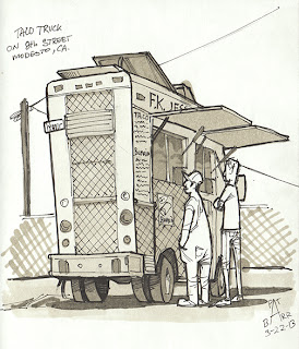


I found a blog called urbansketchers.org and it inspired me to improve this shortfall of mine. Expect a lot more of these in the future.


Tuesday, February 26, 2013
Iron Man!

Here is an Iron Man drawing I did for my buddy Tom. I wanted to draw the old school 70's armor (which was quite fun). Mostly warm and cool grey copics and some pen work afterwards.
Schedule has been crazy as of late, but I am trying to force myself to draw more :)
Subscribe to:
Posts (Atom)